
Bringing your brand identity to life on video: what your graphic designer should provide
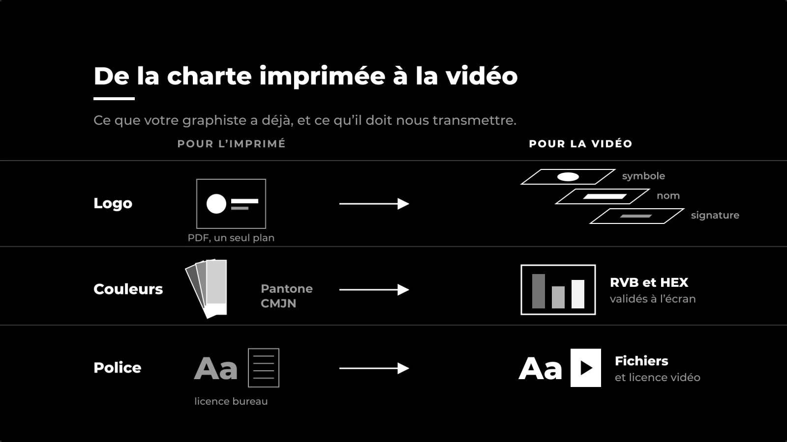
A style guide designed for print often arrives on set as a PDF, complete with Pantone references and a font licence for print. Video branding requires more: from a vector logo split into layers with colours approved on screen, to a licence covering the video and a few animation guidelines.
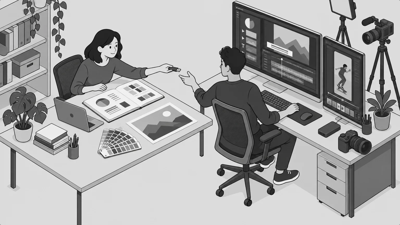
The sound effects, the closing screen, the subtitles and the credits all follow your style guide. When files are missing, we recreate them from a PDF, and any discrepancies are visible on screen – whether it’s a colour that’s slightly off or a blurry logo filling the screen.
So make sure you ask your graphic designer for the correct files before filming begins.
A police licence covering video footage
At many type foundries, the ‘desktop’ licence covers documents and still images, whilst a video broadcast online or on television requires an extension. Adobe Fonts covers film and video production, including broadcast, and fonts under the SIL Open Font Licence – such as most Google Fonts – can be used in video captions without requiring additional authorisation.
For a font purchased from a type foundry, please request the licence text and send it to us along with the files.
Colours verified on screen
A Pantone is a colour ink, whereas video operates in RGB, within the ITU’s BT.709 colour space for HD, where certain vivid colours have no exact equivalent. Pantone does publish RGB and HTML equivalents in its Color Bridge guides, but these remain approximations, and two Pantone tools sometimes give different values for the same colour.
Ask your graphic designer for a HEX code that they have visually verified on a calibrated screen.
The text is thin and in a bright colour
Most broadcast videos record colour with less detail than light, as in 4:2:0 one colour sample is used for every four pixels. Fine text in red or blue therefore loses its sharpness at the edges, so we thicken it or change it to white against a solid background of that colour.
The vector logo: one layer per element
A logo in PDF or PNG format is sufficient for a static graphic. To animate it, we need the vector file, in SVG or .ai format, with one layer per element (the symbol, the name, the signature), so that it remains crisp on a 4K full-screen display and each part can be animated separately.
Gradients
A gradient may break up into bands during export, depending on the colour depth, the codec, the bitrate, the difference between shades and the platform’s recompression. 10-bit colour depth and a slight grain reduce this risk. Please also provide us with the start and end values for each gradient.
A few rules on movement, written down once
A printed style guide says nothing about the animation. For the visual design, we work with you to determine when the logo appears and disappears, the duration of the transitions, and the size of the tagline beneath the name – between 50 and 65 per cent of the name’s size. We determine the duration of a synth by reading it aloud twice at a steady pace.
These guidelines fit on a single page and can be reused for every subsequent video.
Our prices
| Graphic design and motion design for a video | 500 CHF |
| Project visual identity | from 600 CHF |
Preparing the visuals for your video
Please send us your brand guidelines, any files you have and the videos you’ve planned, and we’ll let you know what’s missing before we start designing the branding.
Sources
Documentation accessed in October 2026. Licence terms vary from one foundry to another: the text of your licence shall prevail.
News
Also worth reading
Captation de spectacle : quel dispositif pour quel budget
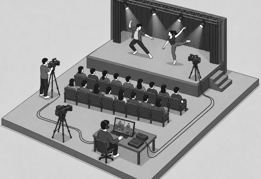
With us, filming a performance costs between 700 and 1,400 CHF per performance. The intended use of the footage determines the price: for archival purposes, a wide shot is sufficient, whereas a film intended for broadcast requires multiple camera angles and editing.
Read more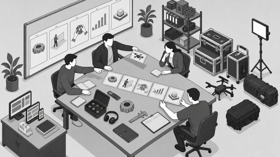
Capter une conférence, un colloque ou une assemblée : le dispositif qui tient
You can’t redo a conference. Unusable room microphones, slides that are illegible on screen, speakers backlit by the stage lights: these are the well-known pitfalls of institutional recording, and we ensure the sound, picture and supporting materials are of a high standard so that we can still deliver a recording fit for broadcast.
Read more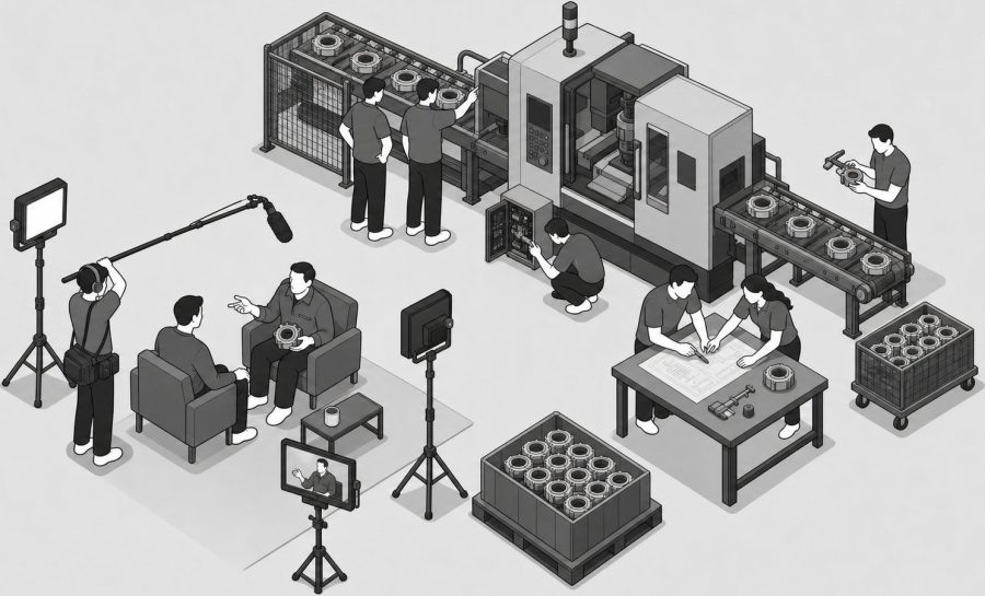
Un film de votre entreprise, tourné chez vous
We produce a one- to two-minute promotional film at your business premises, aimed at SMEs, retail businesses and craftspeople in northern Vaud. Prices start at 800 CHF and the film is delivered to you within three weeks.
Read more